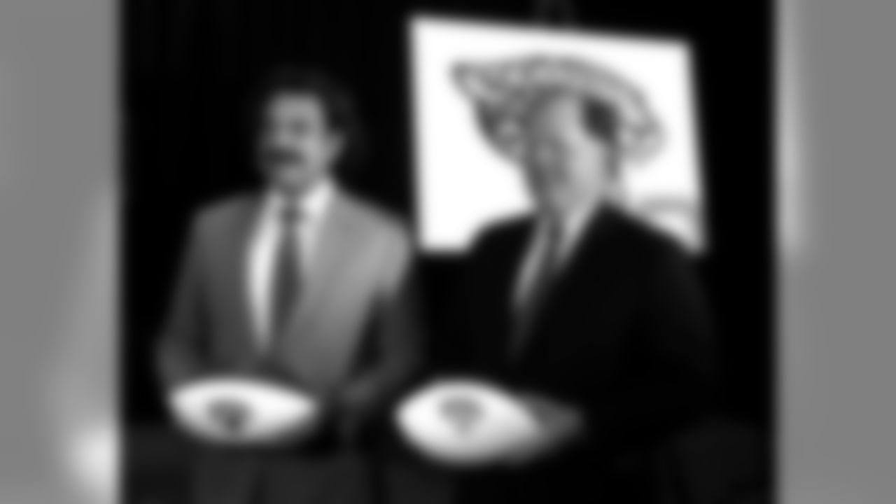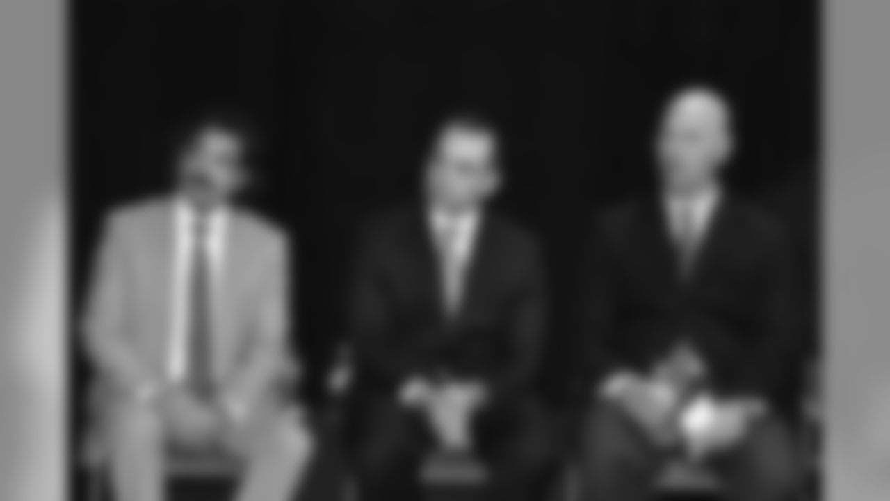

When Shad Khan took control of the Jaguars in January 2012, it was a given that such a successful man with an obvious flair for life would put his own stamp on the franchise. He certainly did that when he brought Mark Lamping in as president of his organization less than two months later.
The two men would begin a process of overhauling the front office and the organization, and of changing the outward appearance of the Jaguars. That process involved a deep dive into the franchise, the unique qualities of Jacksonville and north Florida and even the personality Khan wanted to project. It brought together professionals from the worlds of football, business, marketing and creative to pull together a new look with a nod toward the history of the Jaguars.
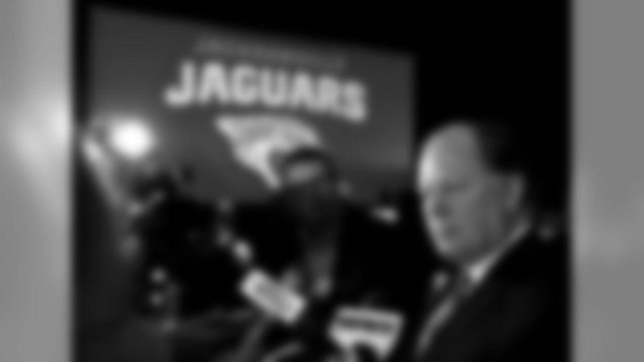
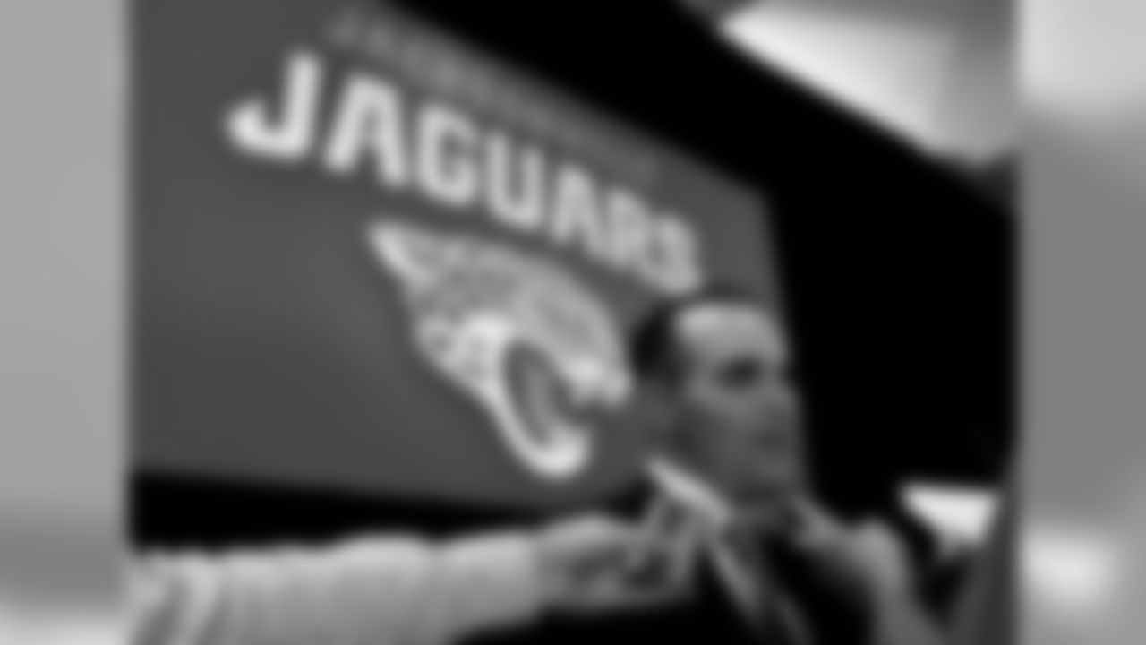
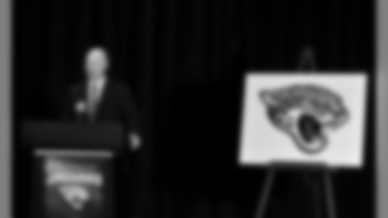
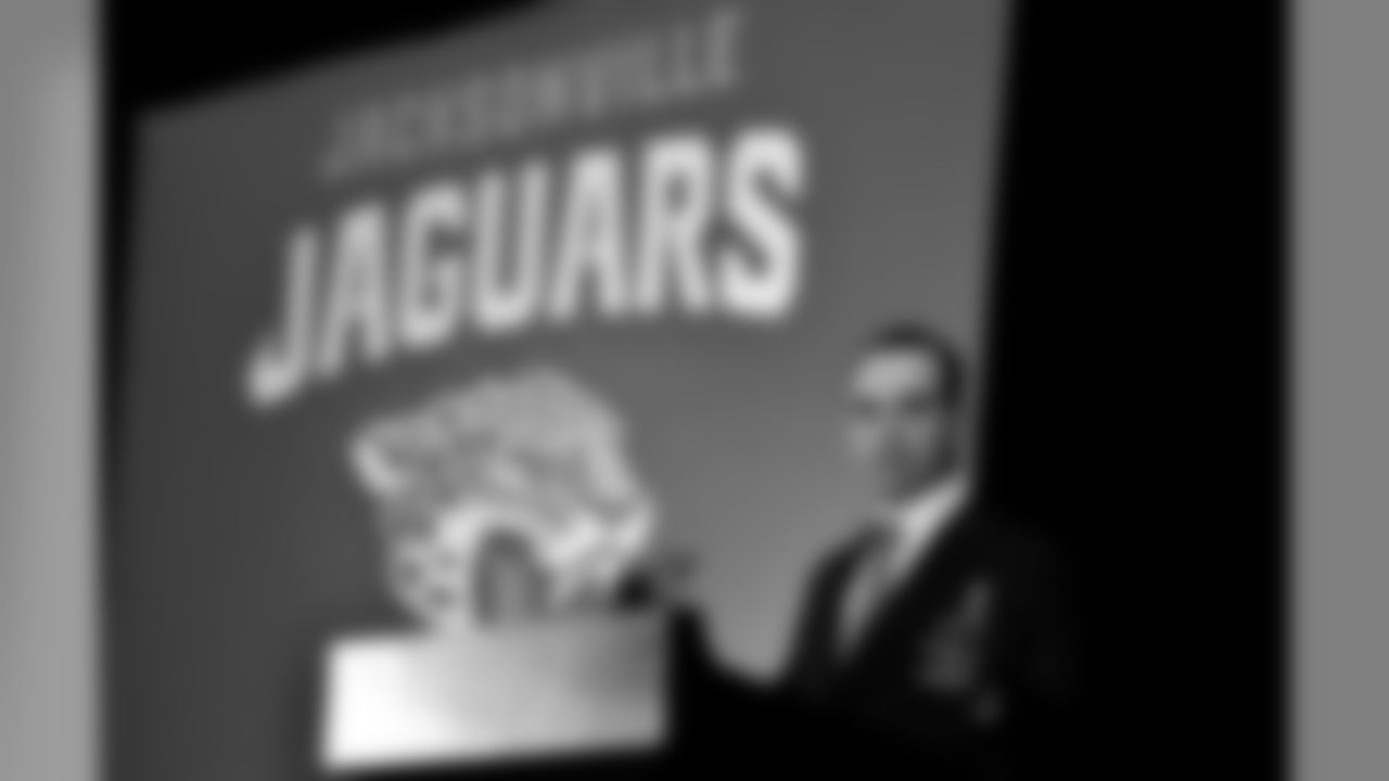
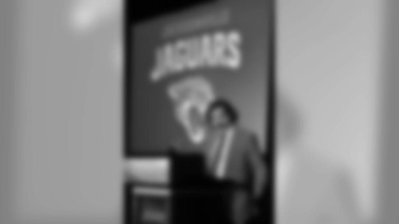
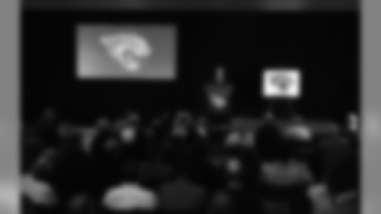
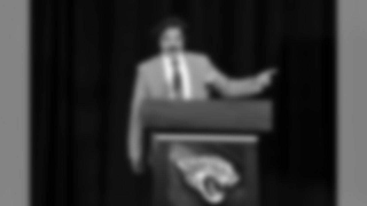
On February 5, 2013, the Jaguars unveiled a new logo after months of rumor and speculation about what Khan and the new regime had wrought. The first picture shown was of the re-drawn Jaguar that adorned the helmet. My first thought that day was it was aggressive, much like the short tenure of Khan as owner, and that it was much more realistic than the previous rendition that was initially panned as looking too much like a cartoon character.
The new look unveiled that day took the franchise further into its newest era, but I have to say the touch of teal in the logo does its job, connecting the new with that which had come before in a subtle yet nostalgic way.
Jaguars owner Shad Khan and team brass address the future of the franchise and unveil a new identity.